


 Email
Email SMS
SMS Whatsapp
 Web Push
 App Push
 Popups
 Channel A/B Testing
  Control groups Analysis
 Frequency Capping
 Funnel Analysis
 Cohort Analysis
 RFM Analysis
 Signup Forms
 Surveys
 NPS
NPS Landing pages personalization
  Website A/B Testing
  PWA/TWA
 Heatmaps
 Session Recording
 Wix
Wix Shopify
 Magento
 Woocommerce
 eCommerce D2C
  Mutual Funds
 Insurance
 Lending
  Recipes
  Product Updates
 App Marketplace
 Academy
Quick answer: The 12 best lead generation form practices that lift conversion in 2026 are offering clear value, adding trust signals, using freebies, writing strong CTAs, creating urgency, gamifying the form, using white space, providing options, keeping it simple, adding a confirmation checkbox, showing social proof, and including a relevant image. Multi-step forms and mobile-first design tend to drive the biggest gains.
A study by Salesforce, the American cloud-based software company, states that firms great at nurturing leads bring in 50% more sales-ready leads at 33% lower cost. Lead generation forms, also called web forms, lead gen forms, or lead forms, are forms placed on landing pages to turn visitors into leads.
The challenge is building a lead form that visitors find difficult to resist. VWO’s 2026 research found that nearly 50% of marketers say web forms are their highest-converting lead generation tool, which makes form quality one of the biggest unfair advantages in pipeline growth.
I’ve collected 12 best-performing examples of lead generation forms across the web, plus the real reasons each one works, so your team can pull practical inspiration rather than copy generic patterns.
12 Lead Generation Form Tips at a Glance
| # | Tactic | Why It Works | Real Example | Difficulty |
|---|---|---|---|---|
| 1 | Offer value | Visitors trade contact info for tangible benefit | Unico Nutrition | Low |
| 2 | Trust & privacy signals | Reduces friction around data sharing | Vtiger CRM | Low |
| 3 | Freebies and lead magnets | Reciprocity principle drives action | Ebook + checklist forms | Medium |
| 4 | Strong CTA copy | Specific verbs outperform generic submit | “Get my free guide” | Low |
| 5 | Create urgency | Scarcity drives faster decisions | “22 accounts left” / countdown | Low |
| 6 | Gamification | Progress meters keep visitors engaged | TheZebra.com insurance quote | Medium |
| 7 | White space and design | Better scannability, less hesitation | Minimalist landing forms | Low |
| 8 | Provide options | Self-segmentation removes “submit” friction | SnackNation home vs office | Medium |
| 9 | Keep it simple | Fewer fields = higher completion rate | Yumi baby food signup | Low |
| 10 | Confirmation checkbox | Qualified opt-in, compliance, deliverability | GDPR-friendly forms | Low |
| 11 | Social proof | Reduces perceived risk via consensus | Customer logos, testimonials | Low |
| 12 | Include an image | Visual focal point pulls attention to copy | Marie Forleo signup | Low |
12 Best Lead Generation Form Examples in Detail
1. Offer value
Your users should get something tangible in return for handing over their details. The offer needs to motivate them enough to overcome the friction of typing. One way to do this well is to convey the benefits of filling out the form upfront, in clear language, not buried in fine print.
Unico Nutrition keeps it dead simple. Their lead form tells you upfront — fill this out and you get a discount on your first order. No long explanations, no vague promises. The copy is short enough that visitors understand the deal before they even have to think about whether it’s worth their time. That kind of clear value exchange gets way more signups than forms that ask for an email without offering anything obvious in return. And once someone fills it out, that’s your cue to start a proper lead nurturing sequence that turns that first discount into a long-term customer.
Pay attention to the crisp, clear, bold wording on it. That’s the standard your sentences on a form should hit. If a visitor has to read your form twice to understand what they’re getting, the copy is too clever and not clear enough.
2. Make them feel secure

When you ask visitors to fill out a form for your firm, they often feel vulnerable if they don’t already know you. They wonder what you’ll do with their personal information, whether they’ll get spammed, and whether their data is protected. Those concerns are reasonable and your form needs to address them visibly.
You can relieve them of these concerns by including a link to your privacy policy directly on the form, alongside a brief security signal.
In the image above, you can see a lead form from Vtiger, a leading cloud CRM solution. It includes links to its Privacy Policy and Terms of Service right beside the submit button. Visitors unfamiliar with the brand can scan the privacy policy before they provide information, which reduces the abandonment rate significantly for first-time visitors.
3. Include freebies

Humans are naturally drawn to things offered for free. The reciprocity principle is one of the most reliable behavioral patterns in marketing, and lead generation forms are a clean place to use it.
You can give away freebies like an ebook, a service trial, a checklist, an online class, a software download, a training video, a template, a coupon, or something similar in return for filling out your form. The freebie should match the audience’s actual pain point, not just be cheap to produce.
Apart from generating leads, this approach earns attention for your brand and starts the relationship on a positive note. If you’re exploring tools to build or optimize these experiences, G2’s in-depth guide on lead capture platforms helps you compare options based on real user feedback.
Freebies play on the rule of reciprocity. When someone offers something nice to you, you feel the urge to do something nice in return. So pair your lead form with a freebie that’s genuinely useful, not a recycled PDF nobody opens.
4. Have a strong CTA

You need a Call to Action (CTA) on your lead forms that gives a clear, specific instruction. Phrases like “Download now,” “Send me the checklist,” “Subscribe,” “Learn more,” “Read more,” “Book now,” “Click here,” or “Watch now” all outperform a generic “Submit” because they describe what happens next.
A strong CTA is clear, crisp, and compels visitors to act favorably. The verb does most of the work, which is why testing CTA copy tends to deliver bigger conversion lifts than testing color or button shape. For more depth on CTA wording, our breakdown of email CTA examples covers the same principles applied to email, and the patterns translate directly to form buttons.
The design of your lead form’s CTA matters almost as much as the copy. CTAs of different shapes, colors, and sizes work for different industries and audiences, so do the homework on what already converts in your field before guessing.
5. Create urgency
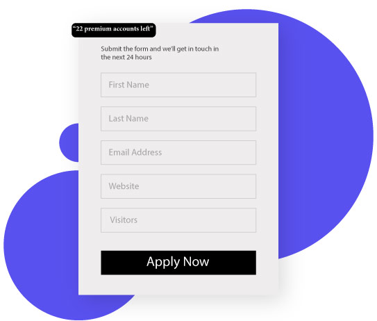
Yes, you heard it right. Just as you can create urgency on your e-commerce site, you can do so with your lead forms too. Look at the lead generation form example below.
At the top of the form, a small box reads “22 premium accounts left.” That single line nudges the visitor to sign up before the limited spots run out. Scarcity is one of the oldest psychological triggers in marketing, and it still works when applied honestly.
Another way to create urgency is including a countdown timer in your lead form. The ticking clock tells visitors that time is running out and the offer ends soon, which pushes them to act now rather than bookmark and forget. A word of caution: use real urgency, not manufactured pressure. Repeat visitors notice when the countdown resets every time they reload the page, and the trust loss costs more than the short-term conversion bump.
6. Gamify it
Gamification of lead forms motivates participation and promotes engagement. It also simplifies the experience of filling out a long form by turning it into something interactive rather than tedious.
For instance, the lead generation form by TheZebra.com, an insurance comparison site, makes form filling genuinely engaging for users. TheZebra asks for some basic information upfront, then enhances the precision of your insurance quote through gamification as you answer more questions.
When a user submits responses, a percentage meter advances in real time, motivating them to answer more questions to see the final quote. BrokerNotes uses a similar quiz-style approach and reportedly hits a 46% conversion rate, which is far above the typical lead form. The pattern works because progress feels concrete instead of abstract.
7. Incorporate white space

White space is an underrated element to include in your lead form. Science says including white space helps readers read and understand text, although it slightly decreases reading speed. The trade-off is worth it because comprehension matters more than speed in a form context.
White space also helps visitors navigate the form and focus on the copy without distraction. The visual breathing room reduces hesitation around filling it out, which translates directly to higher completion rates on otherwise identical forms.
Leave plenty of white space around your CTA and other elements in the form. Look at how well-designed the example above is. The copy and the image hold your attention because of the generous amount of white space around them, not in spite of it.
8. Provide options
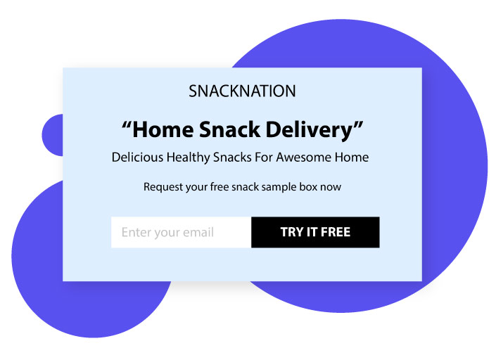
Lead forms that provide options get visitors clicking on something and personalizing their customer journey themselves. Here’s an example from SnackNation, a healthy snack delivery service in America.
The form includes two options: “office snack delivery” and “home snack delivery.” This helps identify the type of lead so they can be shown more personalized questions based on actual need. The visitor self-segments without realizing they’re doing the work for you.
Limiting the options to two also allows easier completion and eliminates the need for a “submit” button entirely. The click on the option is the submit. This pattern shows up consistently in higher-converting B2B forms because it removes one of the most common abandonment points.
9. Keep it simple
Visitors find it easier to share their details when the form is short and simple. Short forms mean less time and less effort, which translates to higher completion rates.
If you need to collect more information, break the long form into a multi-step popup and include custom placeholder text (or watermark text) inside the fields. Multi-step forms feel shorter because the visitor only sees one or two questions at a time, even when the total field count is similar to a long single-page form.
Placeholder text appears within form fields and disappears automatically when the user types their own answer. It’s there to give users examples of what to enter and the format expected. The image below shows an example from Yumi, a site for baby food delivery, where the placeholder text gently guides each field without cluttering the design.
10. Include a confirmation checkbox
Firms that collect email IDs from visitors to send marketing emails usually confirm consent through a follow-up email asking for explicit opt-in. That works, but it leaks leads at the second step.
A better idea is including a confirmation checkbox directly on the lead form itself. This ensures you receive only qualified leads, gets you ahead of GDPR and CCPA requirements, and improves email deliverability metrics because the list quality is higher from day one. Pair the checkbox with a clean welcome flow built in a marketing automation platform and the follow-up runs itself.
11. Include social proof

Adding social proof to your lead form attracts and motivates visitors to fill it out. Human nature assumes that if a majority of people follow something, it’s probably the correct behavior. That’s the underlying mechanism. Apply it on the form and conversion rates move.
Social proof can take the form of testimonials, case studies of existing customers, brand logos of well-known clients, words from credible experts in your industry, celebrity quotes, or a certification or accreditation badge. The specific format matters less than the placement: visible near the form, not buried below the fold.
Look at the image above which includes multiple social proofs at once. It states that the person built one of the most popular YouTube channels and that several leading magazines featured him. The combination establishes him as an accepted authority who actually has command in his niche, which is exactly what new visitors need to see before they hand over their email.
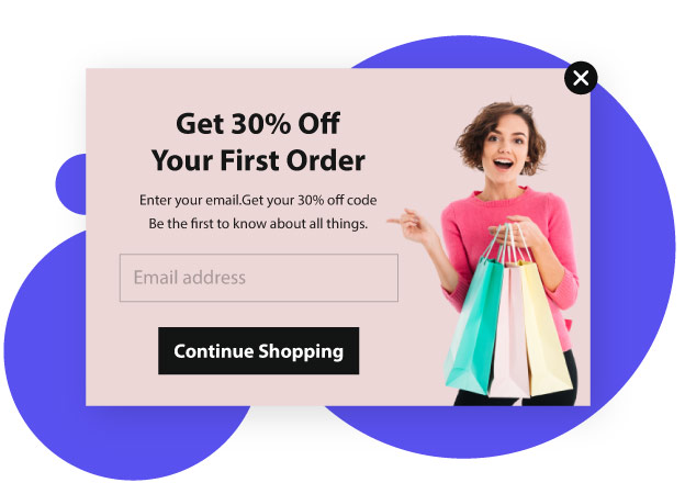
12. Include an image
Images are always more attention-grabbing than text alone. They pull the visitor’s focus toward them first, then redirect attention to the surrounding copy. Make sure your image stands out yet matches the overall site theme, because mismatched visuals create more friction than no image at all.
Look at the lead form from Marie Forleo, an American entrepreneur known for her best-selling advice books. The design is minimalist and asks only for name and email address. There’s no overwhelming list of fields to scare the visitor away.
The copy is well thought out and well written to earn the visitor’s trust. The image of Marie herself adds a personal element that a generic stock photo wouldn’t. When the brand is built around a person, the founder’s photo tends to convert better than any abstract illustration.
Lead Generation Form Types That Actually Convert
The 12 tips above apply to almost any lead form, but the form type itself matters too. Different goals call for different formats, and matching the right type to the right intent is half the battle.
- Newsletter signup forms. Single email field, lowest friction, top-of-funnel only. Morning Brew is the canonical example with a simple homepage form that collects only an email.
- Demo request forms. Longer forms with qualification fields (company size, role, use case). Slack uses a two-step pattern where email is captured first, then the rest of the qualification questions appear on the next page.
- Quiz-style lead forms. 3-7 interactive questions delivering a personalized result. Purple Mattress uses this for mattress matching. BrokerNotes uses it for broker matching with a reported 46% conversion rate.
- Multi-step forms with progress bars. Breaks long forms into bite-sized chunks. Lemonade’s insurance quote and KlientBoost’s consultation form both use this approach with visible progress indicators.
- Gated content forms. Trade contact info for a downloadable resource. Airtable Academy gates recordings behind a short form to keep generating leads from evergreen content.
- Mobile exit-intent popups. Triggered when a user moves to leave. Blume, a Canadian self-care brand, converts 5% of mobile visitors this way, which is higher than the popup average of 4.01%.
- Pricing calculators and estimators. Interactive forms that produce a number at the end (price estimate, ROI calculation, savings projection). These work especially well in B2B where pricing is custom and the calculator does the qualification work.
Lead Generation Form Best Practices for 2026
The fundamentals stay stable year over year, but the execution shifts. Five practices matter most going into 2026:
- Mobile-first design. Over 60% of web traffic is now mobile, and lead forms that aren’t designed for thumb-tapping leak conversions hard. Test on a phone first, desktop second.
- 5-minute follow-up speed. Responding to a form submission within five minutes can multiply your contact rate dramatically compared to waiting even 30 minutes. The data on this is consistent across multiple studies, and the tooling to act on it is mature.
- Multi-step forms over long single-page forms. Breaking the form into 2-3 steps with a progress bar reduces perceived effort and increases completion, even when the total field count is identical.
- Conditional logic. Show or hide fields based on previous answers. A startup founder gets a different path than an enterprise procurement director. The form feels like a consultation instead of an interrogation.
- Connected post-submission flows. The form is the start, not the end. Hook submissions directly into customer journey orchestration so the right follow-up email, SMS, or in-app message fires automatically. Manual handoffs leak leads every time.
AI-Powered Lead Form Qualification (The 2026 Frontier)
The newest shift in lead generation forms is on the qualification side, not the design side. Agentic AI systems can score and route leads in real time as the form is being filled, which changes the math on what counts as a high-quality lead.
The old pattern: visitor fills form, lead lands in CRM, sales rep manually reviews and decides who to call. The new pattern: visitor fills form, AI scoring runs the moment they submit, enterprise leads route to senior account executives, small business inquiries go to inside sales, low-intent leads enter a nurture sequence automatically. The total elapsed time between submission and the right next action drops from hours to seconds.
Pair this with a strong email marketing follow-up that fires within minutes of the form submission, and the lift compounds. Speed and relevance of follow-up remain the two biggest factors in conversion from lead to customer.
Common Lead Generation Form Mistakes to Avoid
For balance, five mistakes show up repeatedly in lead form deployments that underperform. Worth flagging because the failure modes are predictable.
- Asking for too many fields. Every additional field after the first three drops conversion measurably. If you don’t need it today, don’t ask for it.
- Slow follow-up. A lead that gets a response in 5 minutes is significantly more likely to convert than one that waits an hour. The tools to act fast are cheap. The cost of being slow is hidden but real.
- Generic CTA copy. “Submit” tells the visitor nothing. “Get my free template” or “See pricing now” tells them exactly what happens after they click. The verb does the work.
- No thank-you page or expectation setting. The moment after submission is peak engagement. Use it to confirm what happens next, when they’ll hear from you, and what to do in the meantime. A solid confirmation email template right after submission carries this same role.
- Hidden privacy or consent options. Visitors notice when consent is buried. The trust loss costs more than the marginal completion rate gain.
Frequently Asked Questions
What is a lead generation form?
A lead generation form is a web form placed on a website or landing page that collects contact information and qualifying details from potential customers. In return, the business offers something of value (a free trial, a downloadable guide, a pricing estimate, or a consultation). That exchange turns anonymous visitors into real leads that marketing and sales teams can follow up on.
What are the best lead generation form examples?
The best lead generation form examples include short newsletter signups (Morning Brew), multi-step demo request forms (Slack), quiz-style lead forms (Purple Mattress, BrokerNotes), insurance quote gamification (TheZebra.com, Lemonade), and minimalist popup signups (Marie Forleo, Blume). The right one for your team depends on goal and intent. Top-of-funnel email capture benefits from short forms. Bottom-of-funnel sales qualification benefits from longer multi-step forms with conditional logic.
How do I use website forms for lead generation?
Pick one high-traffic page (homepage, pricing page, or top blog post) and add a relevant form. Match the form type to the page intent: a newsletter signup on a blog post, a demo request on the pricing page, a quiz on a product comparison page. Then hook the form submission into your marketing automation tool so the follow-up email fires within minutes. Speed of follow-up is one of the strongest predictors of whether a lead converts.
How many fields should a lead generation form have?
For top-of-funnel forms (newsletter, content download), 1-3 fields is the standard. For mid-funnel forms (gated webinars, ebook downloads), 3-5 fields work well. For bottom-of-funnel forms (demo requests, sales inquiries), 5-10 fields are acceptable if conditional logic makes the experience feel shorter. The general rule: every additional field after field three measurably drops conversion rate, so only add fields that drive a real downstream action.
What’s a good lead generation form conversion rate?
Average lead generation form conversion rates land between 2% and 5% across most industries, with popup forms averaging around 4%. Top-performing forms hit 20% or higher (BrokerNotes reportedly converts at 46% with a quiz format, KlientBoost’s multi-step form sees double-digit conversion rates). Big variance comes from page traffic quality, offer strength, and form length. Tracking conversion rate over time matters more than benchmarking against a specific number.
Should I use a multi-step or single-step form?
Multi-step forms work better when you need to collect more than 4-5 pieces of information, because they feel shorter even though the total field count is the same. Single-step forms work better for short forms (1-3 fields) where adding a “next” button just slows the visitor down. The honest answer: test both for your specific audience because the right choice varies by industry and traffic source.
What’s a lead generation form template?
A lead generation form template is a pre-built form layout designed to capture specific types of leads. Common templates include newsletter signup, demo request, contact us, gated ebook download, consultation booking, and quiz-style lead capture. Most form builders (Typeform, Fillout, HubSpot, Webflow) ship hundreds of templates that can be customized for your brand and use case. The template gets you 80% of the way there. The remaining 20% is matching the form to your specific audience and offer.
Positioning your lead form
Now that you have inspirations on what works for lead form design, you also need a quick word on positioning. The placement of the form on the page matters almost as much as the form itself.
Conclusion
A lead form placed above the fold on your landing page gets better visibility and converts better. “Above the fold” means the upper half of the webpage that’s visible without scrolling.
This is the area that initiates engagement while the area below builds on the engagement already created. Positioning your form here maximizes its exposure to prospects and helps capture more leads from the same traffic.
Lead nurturing significantly increases sales over time. The lead generation form is the entry point that converts visitors into leads, and there are different tactics for designing forms that visitors find difficult to resist.
Some of these tactics include offering value, linking to your privacy policy, providing a freebie, writing a strong CTA, keeping the form simple, including social proof, providing options, adding a confirmation checkbox, incorporating adequate white space, and using a relevant image. Pair those with mobile-first design, multi-step layouts where appropriate, and fast follow-up via a connected marketing automation system, and your lead generation pipeline starts moving in the right direction.
Try implementing the ideas from this guide to find success through your lead forms.
Also Read: