Until now, Compare in Insights measured a report against another stretch of time: the previous 7 days, the previous 30 days, the previous year. That tells you whether a number moved, not whether it matters. A single UTM source bringing 700 page views means little until you know the report total was 1000.
NVECTA now adds an Overall option to the Compare menu. Instead of comparing against a past period, it compares every row against the report’s own total, so your figures render as percentages and the composition of a breakdown is readable without exporting the table or doing the arithmetic yourself. The absolute counts stay one hover away.
Where to find it
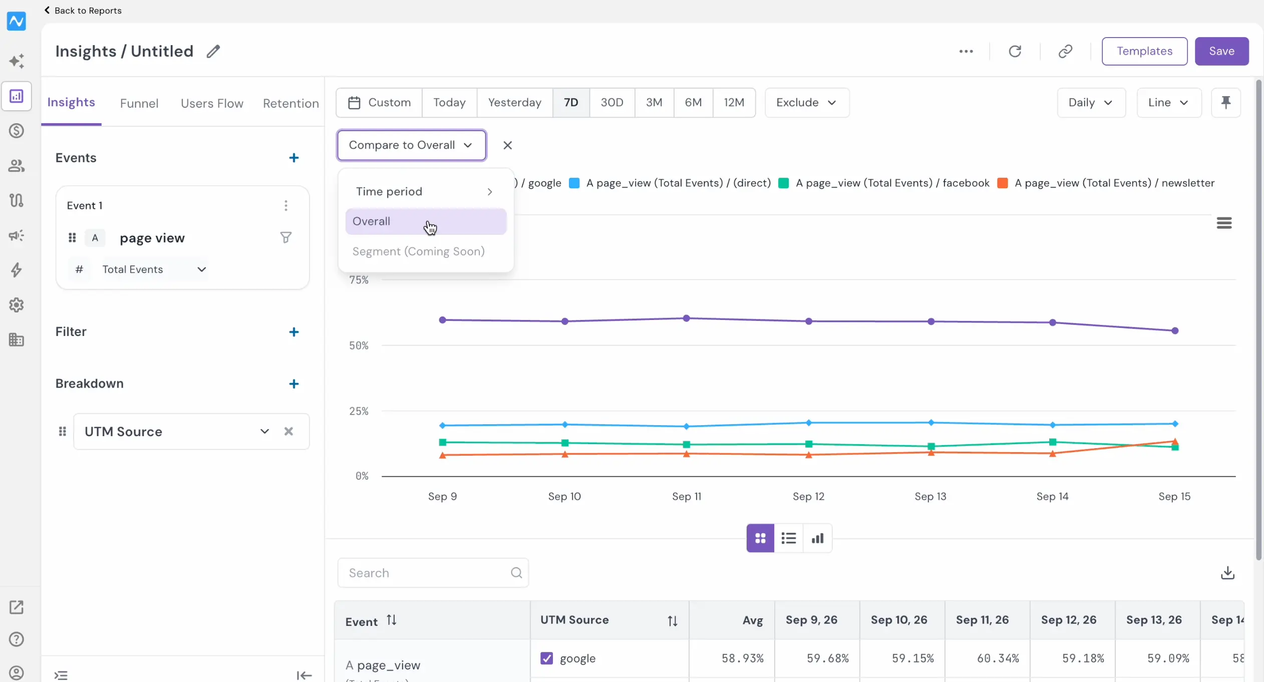
Open an Insights report and build it the way you normally do: pick your events, add a Filter, add a Breakdown, then set the range from the date presets — Custom, Today, Yesterday, 7D, 30D, 3M, 6M, 12M. The Compare button sits directly below that row, beside Sort.
Opening Compare gives you three choices: Time period, Overall, and Segment.
How to use it
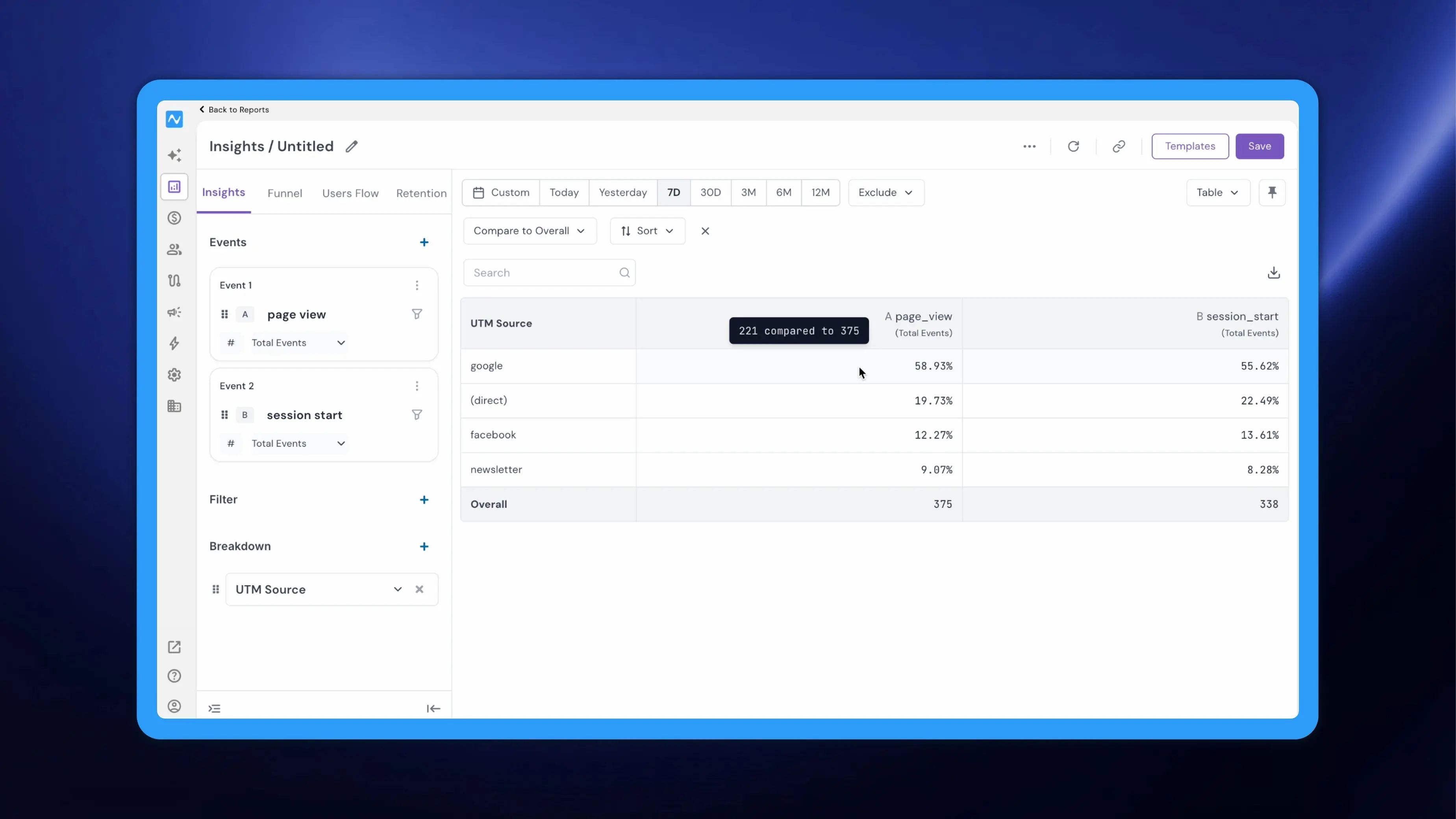
Select Overall. The button relabels to Compare to Overall and every value in the report switches from a count to its percentage of the total. Hover any cell to see the arithmetic behind it: a page view cell reading 58.93% resolves to 221 compared to 375. The Overall row at the foot of the table keeps the absolute totals, so the denominator is always on screen.
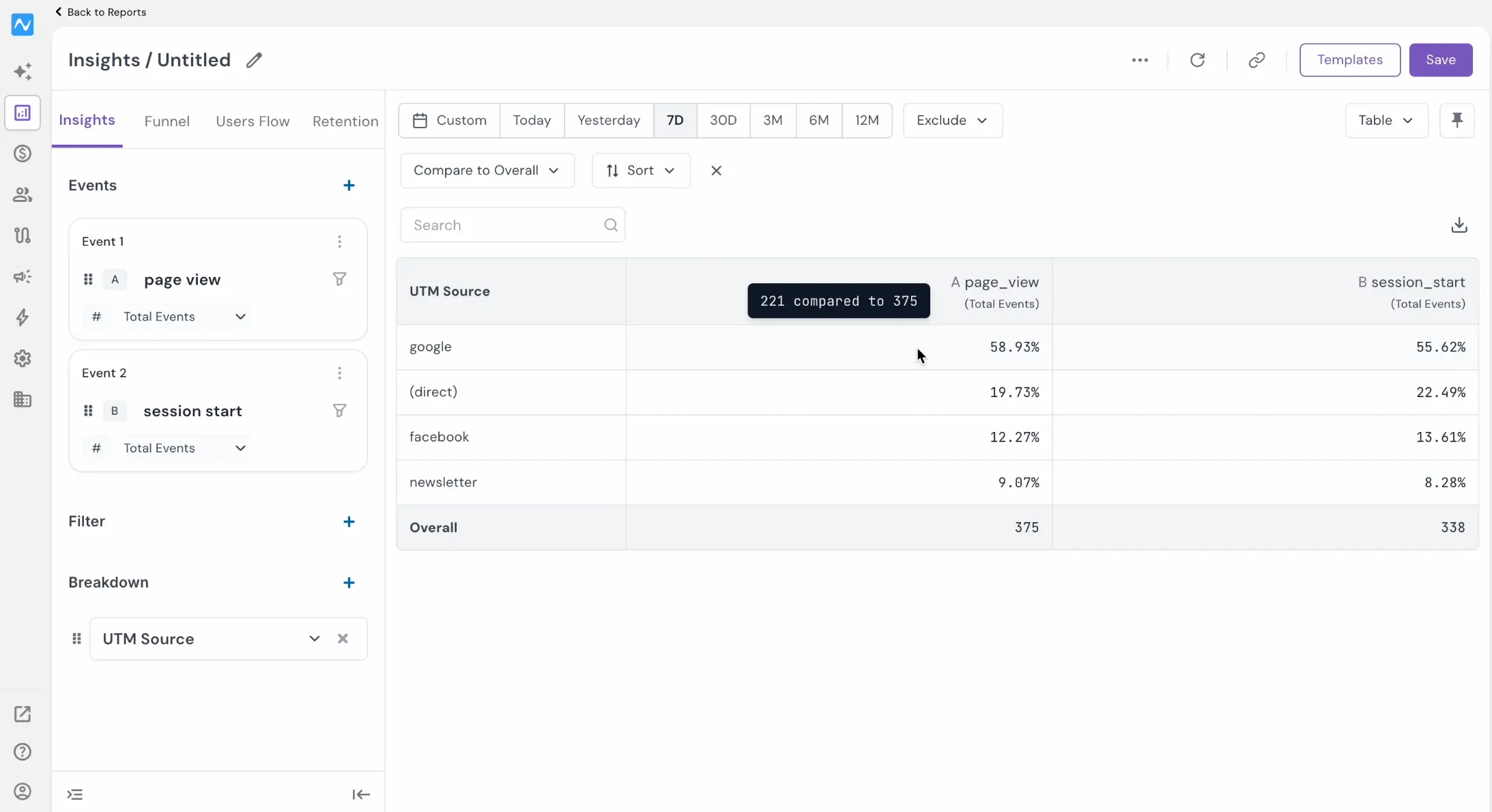
To return to raw counts, click the X beside Compare to Overall, or reopen the menu and pick a Time period comparison instead — period comparison continues to work exactly as it did.
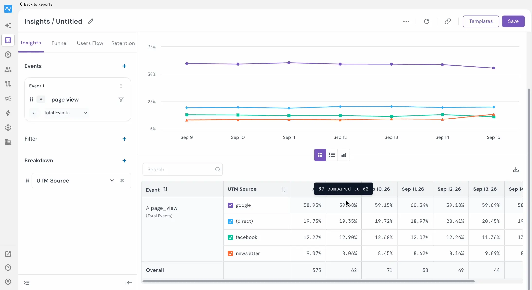
The same behaviour carries into the line chart view. With the report laid out by date, each date column shows that row’s share of the overall figure rather than its count and hovering a cell again reveals the numbers underneath.
Note: Scheduling a report in Overall compare view carries both columns - the percentage and the overall count.
Example
Say you run an e-commerce store and you want to know which acquisition sources are genuinely carrying your traffic this quarter. Build an Insights report on your page view and session start events, add a Breakdown on UTM Source, set the range to 3M, switch on Compare to Overall, and switch to Table view. Instead of a column of counts you have to rank by eye, every source arrives as a share: the leader holds 58.93% of page views, the next 20.8%, and the rest trail off into fractions of a percent. The long tail that looked like activity turns out to be a rounding error, and the two or three sources worth your budget are obvious in one read. Hover the leaders when you need the counts for a plan, and switch to the line chart for date-wise view to see whether a source’s share is actually growing or just had one good week.