

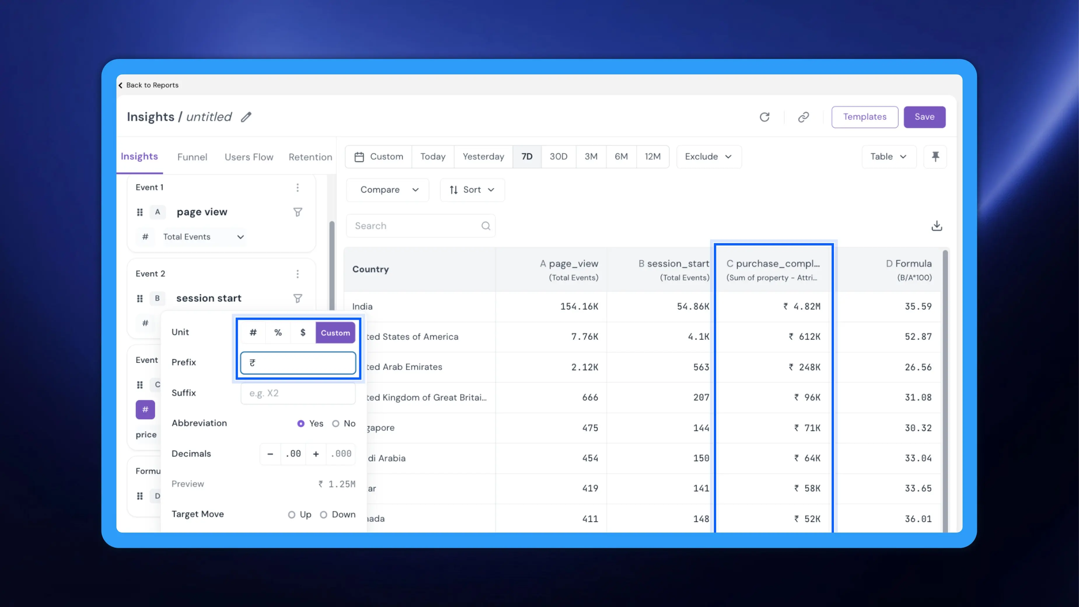
Insights showed every metric as a plain number, so a revenue total looked like an event count and a formula ratio carried no percent sign. Anyone reading the report had to guess what each column meant. NVECTA now lets you set the unit, prefix, suffix, abbreviation and decimal places for each event and formula in Insights, and mark which direction of change is the goal. Your reports read correctly at a glance, for you and for everyone you share them with.
How to use it
Go to Analytics → Insights. In the left panel, every event and formula has a unit chip next to its measure, showing # by default. Click the chip to open the formatting panel.
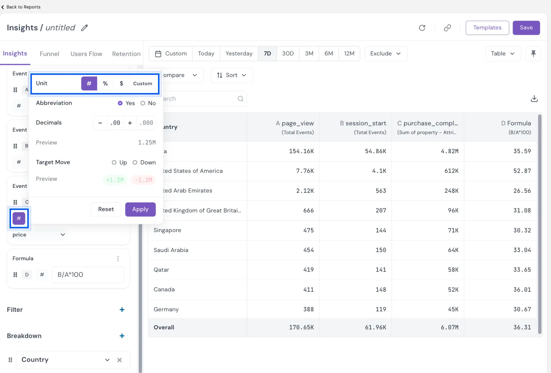
The panel offers these settings, each with a live Preview:
- Unit: # for counts, % for percentages, $ for currency, or Custom. Custom adds a Prefix field (for example, ₹) and a Suffix field (for example, USD).
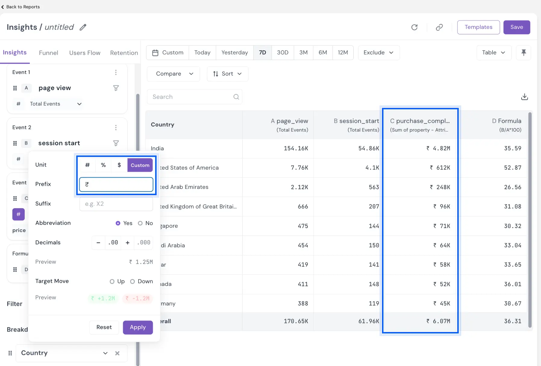
- Abbreviation: Yes shortens large values (1.25M); No shows them in full. Yes is selected by default.
- Decimals: use − and + to set the precision. Two decimal places are the default.
- Target Move: Up or Down, the direction you want the metric to move. It sets the colour of the change value in compare view. Up shows an increase in green and a decrease in red. Down swaps the colours, so an increase shows in red and a decrease in green. Use Down for metrics you want to go down, like cart abandonment, unsubscribes or refunds.
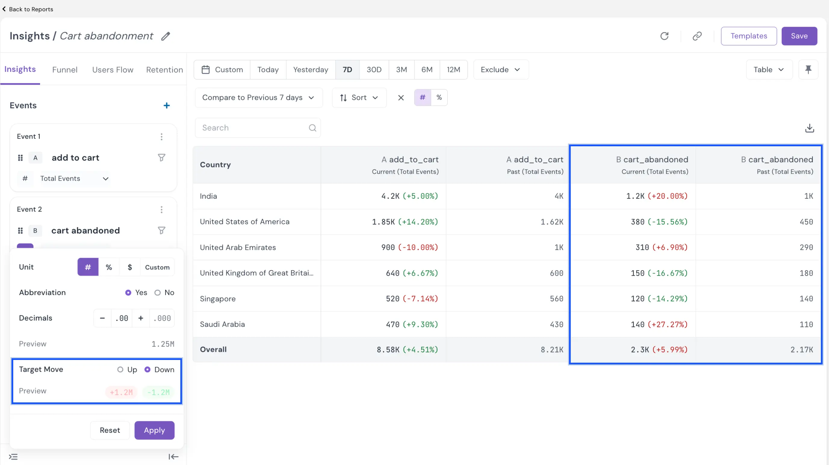
Example: last week 1,000 carts were abandoned in India, and the goal is to bring that down to 800. This week the count rose to 1,200. With Target Move set to Up, Insights would show this +20.00% in green, as if it were good news. Set Target Move to Down on the cart abandoned event and the same +20.00% shows in red. A drop, like 450 to 380 in the United States (−15.56%), shows in green. The add to cart event stays on Up, so its rises stay green.
Click Apply to format the column, or Reset to return to the defaults. The chip in the left panel changes to match the unit, so you can see each metric's format without reopening the panel. Formatting changes only how values are displayed; the underlying numbers stay the same.
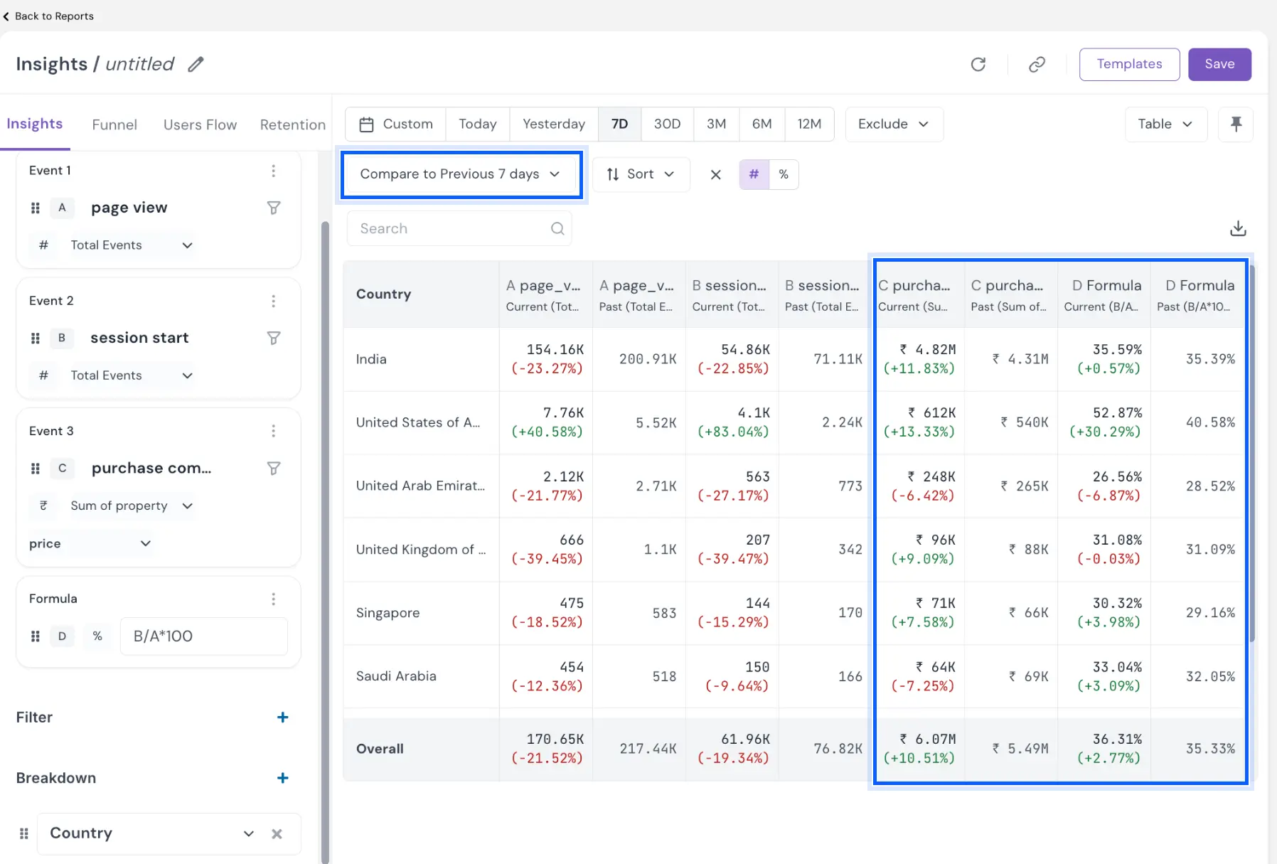
Along with the Target Move other formatting also carries into compare view too, where each column shows its current value, the change and the past value in the unit you chose.
Problem it solves
Numbers without units invite misreading, especially when one report mixes counts, money and ratios and travels to people who did not build it. Formatting at the source gives every reader the same meaning, and Target Move colours each change green or red depending on whether the metric moved the way you want, so a rise in cart abandonment is never shown as a win.
Your Insights reports now say what each number means, in the units your business works in.
